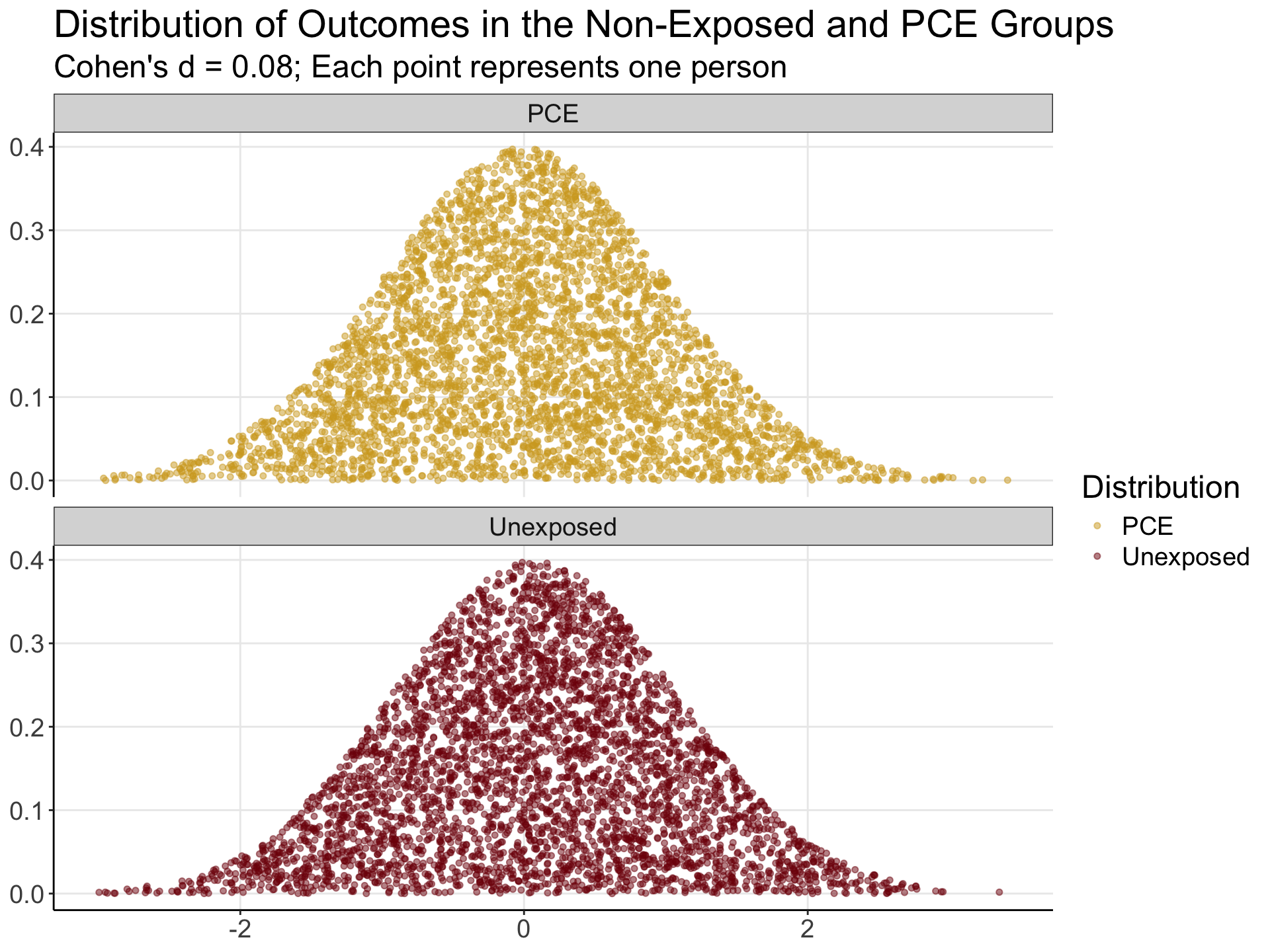
Simulated Overlap for d = 0.08

Author

Anthony Steven Dick

1 Setup and Simulation

2 Figure 6A: Two Distributions by Group

d_long %>%
  ggplot(aes(x, y, color = Distribution)) + 
  geom_point(alpha = 0.5, size = 1.3) +
  facet_wrap(~ Distribution, ncol = 1) +
  labs(title = "Distribution of Outcomes in the Non-Exposed and PCE Groups",
       subtitle = "Cohen's d = 0.08; Each point represents one person") +
  scale_color_rpsy +
  theme_bw() +
  theme(
    text = element_text(size = 18),
    panel.border = element_blank(),
    panel.grid.minor = element_blank(),
    axis.line.x = element_line(),
    axis.line.y = element_line(),
    axis.title = element_blank()
  )

3 Figure 6B: Overlap Visualization

d_long %>%
  ggplot(aes(x, y, color = Distribution)) +
  geom_point(alpha = 0.5, size = 1.3) +
  labs(title = "Overlap of Two Distributions", subtitle = "Cohen's d = 0.08") +
  scale_color_rpsy +
  theme_bw() +
  theme(
    text = element_text(size = 18),
    panel.border = element_blank(),
    panel.grid.minor = element_blank(),
    axis.line.x = element_line(),
    axis.line.y = element_line(),
    axis.title = element_blank()
  )

4 Figure 6C: Annotated Percent Overlap

labels <- d_long %>% group_by(overlap) %>% summarise(n = n(), .groups = “drop”) %>% mutate( prop = paste0(round(n / sum(n) * 100, 1), “%”), x = c(1.5, 0.25, -1, 0.25), y = c(0.2, 0.25, 0.2, 0.2) )

d_long %>% ggplot(aes(x, y, color = overlap)) + geom_point(alpha = 0.5) + geom_label(data = labels, aes(x = x, y = y, label = prop, color = overlap), vjust = “center”, show.legend = FALSE, size = 5) + labs(title = “Percentage of Observations in Each Area”, subtitle = “Frequency Understanding of Overlap”) + scale_color_rpsy + theme_bw() + theme( text = element_text(size = 18), panel.border = element_blank(), panel.grid.minor = element_blank(), axis.line.x = element_line(), axis.line.y = element_line(), axis.title = element_blank() )